
The Danish National Bank
Table of contents
01 The brief
02 The design
03 The process
04 The conclusion
My role(s)
Art Director
Lead Designer
Senior Designer
Deliveriables
Concept Development
UX Design
UI Design
Design System
In close collaboration with the Head of Design at the Danish National Bank, I led a complete redesign of the website from the ground up.
It was a major project that spanned over a year, with multiple design iterations and a strong focus on detail from the bank’s team. The result reflects a close, meticulous collaboration — where every element was refined to meet the highest standards.
Visit the site
 nationalbanken.dk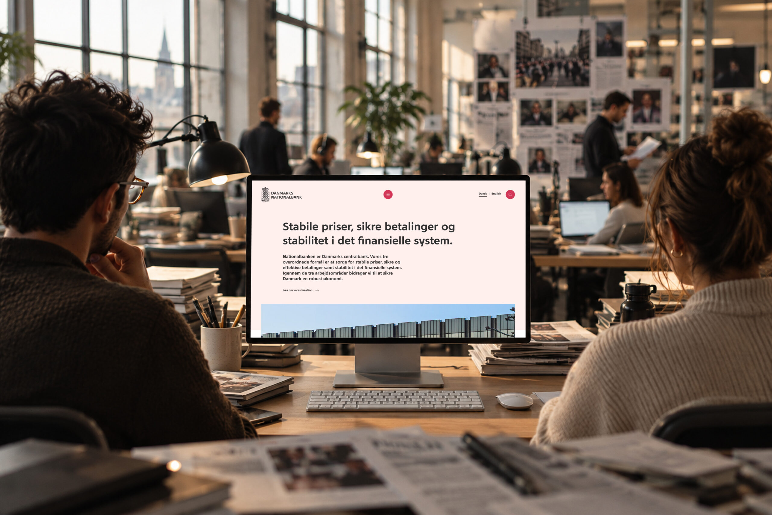
01 The brief
The brief was ambitious: to design the future digital home of Danmarks Nationalbank — built to last. The design should be scaleable, responsive, cohesive and contemporary... And trustworthy.
The goal was a contemporary yet trustworthy design, supported by a flexible modular system that empowers editors while ensuring a strong and consistent visual flow.
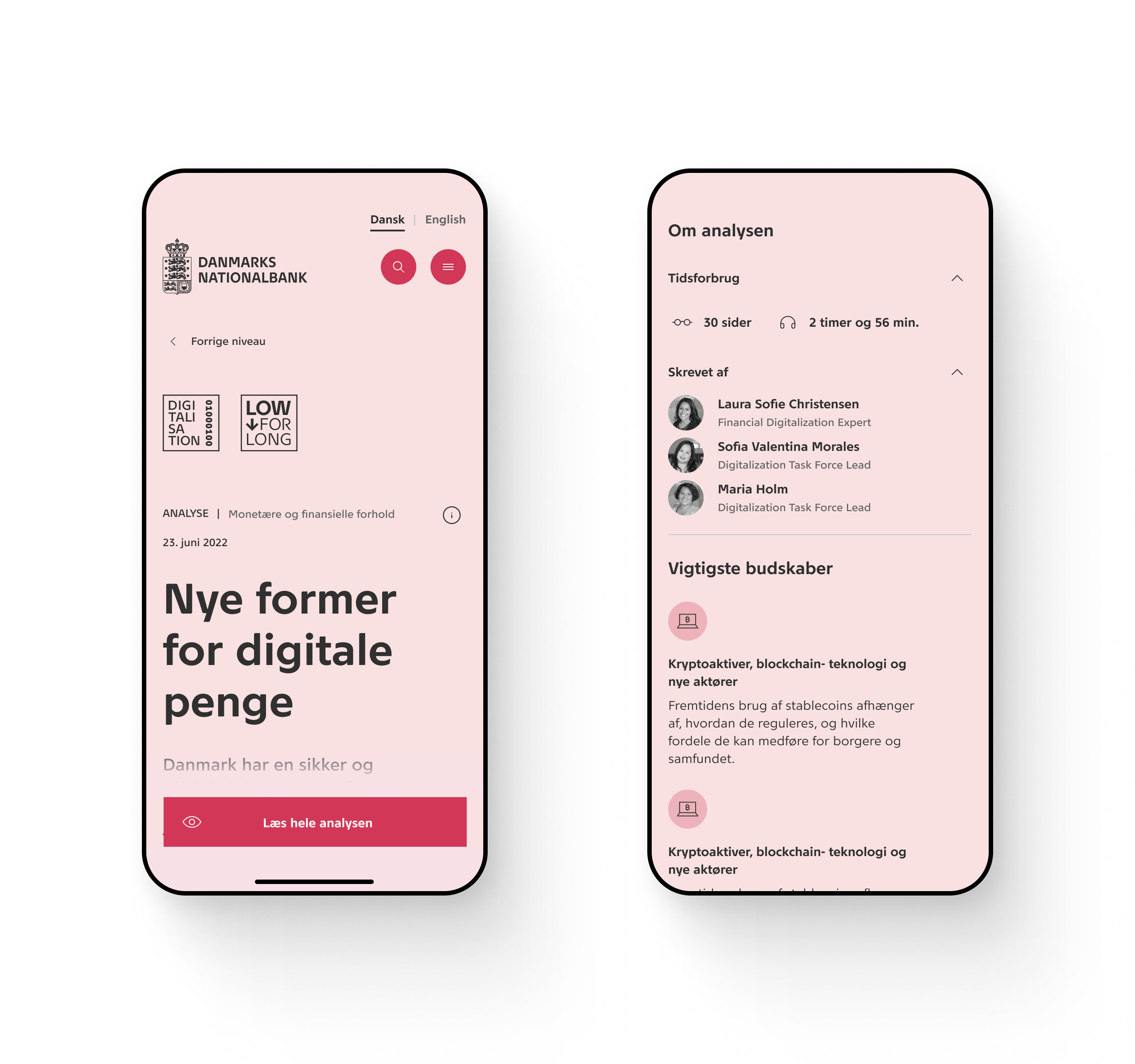
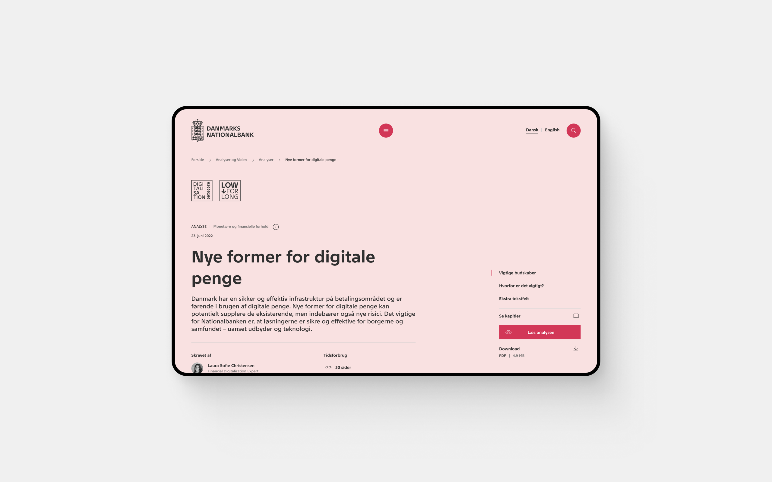
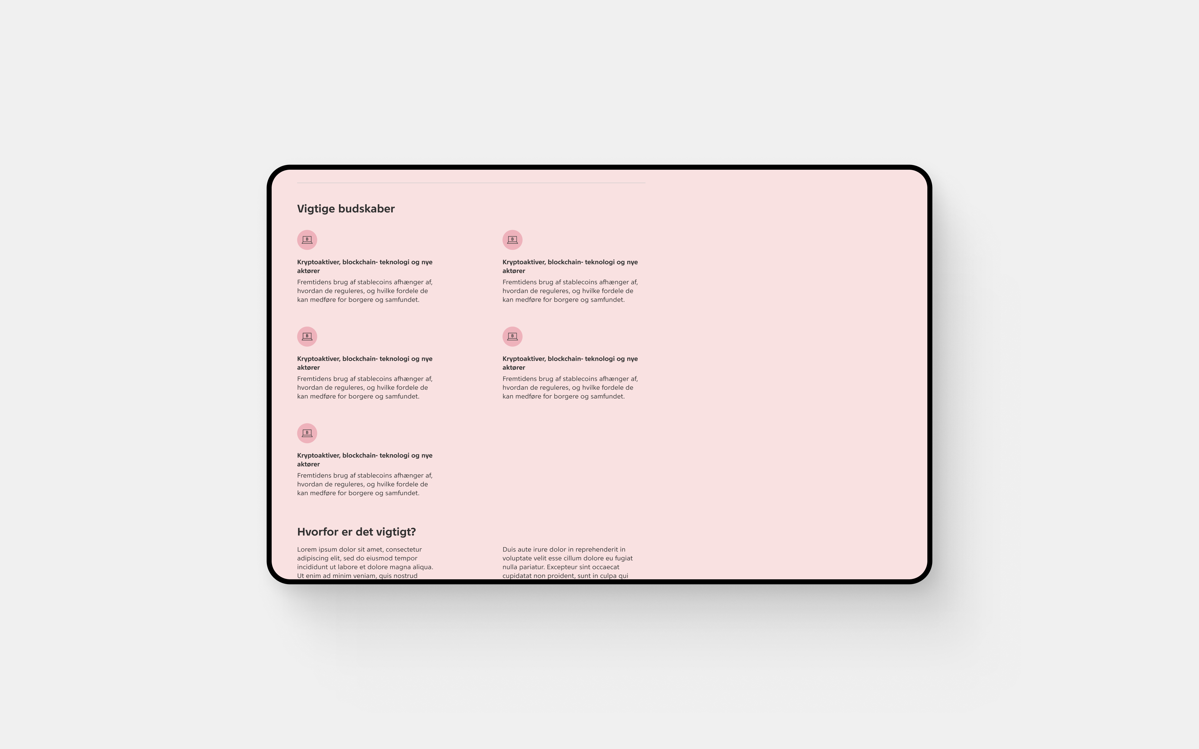
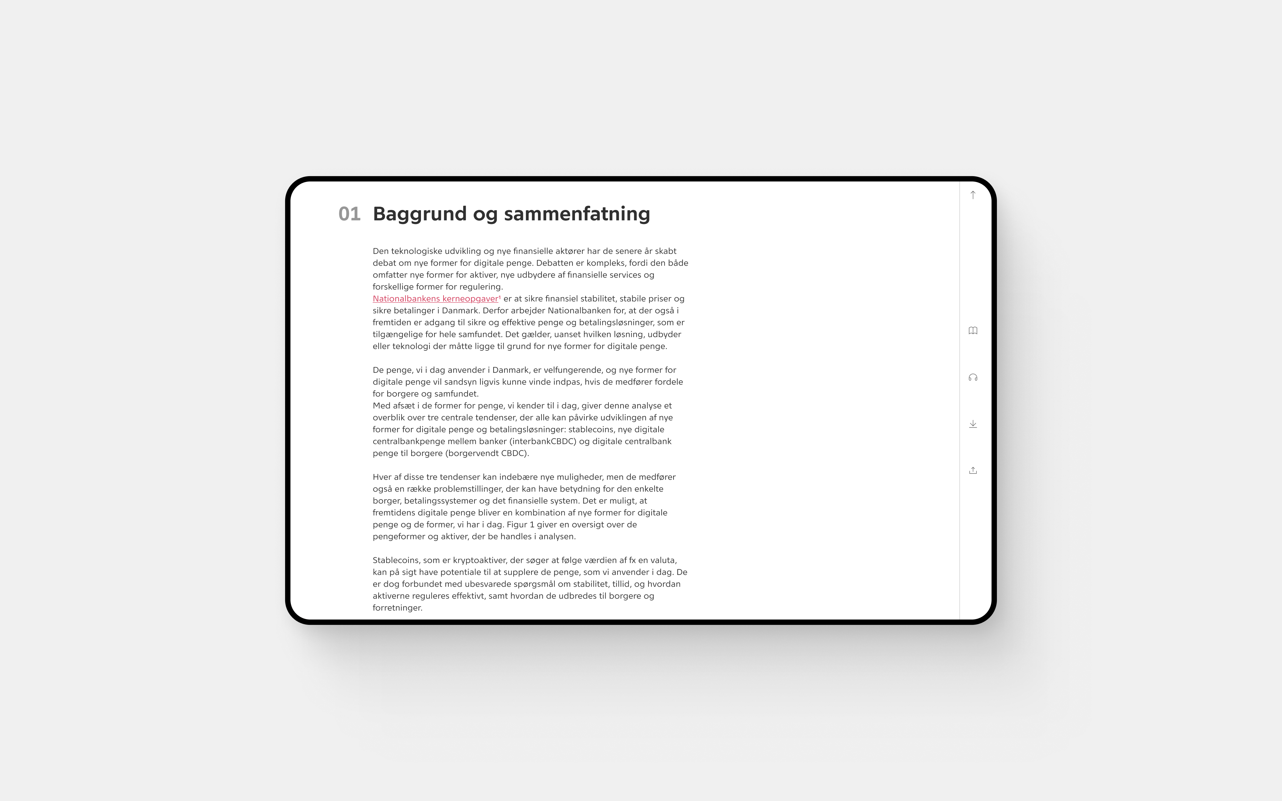
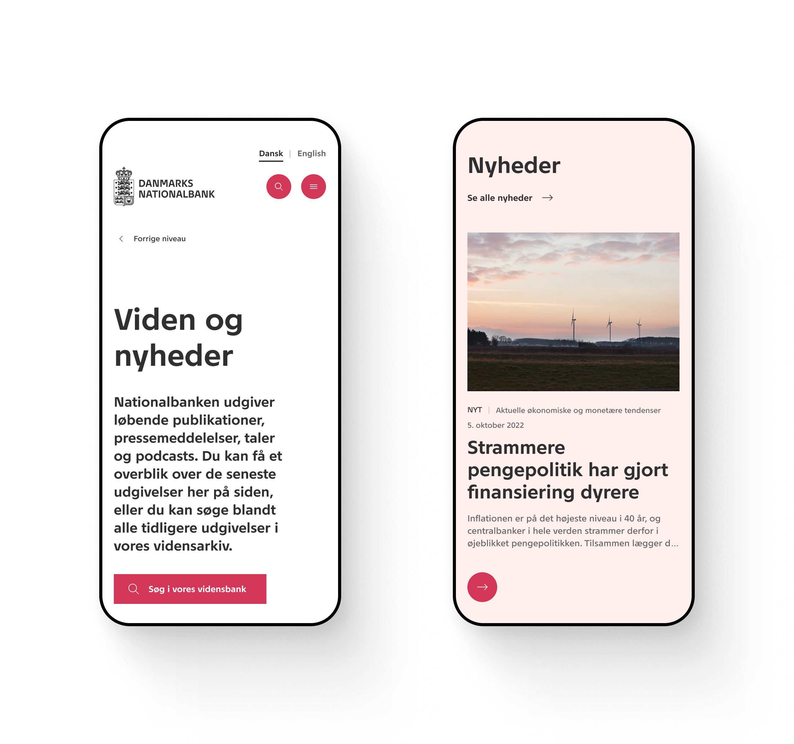
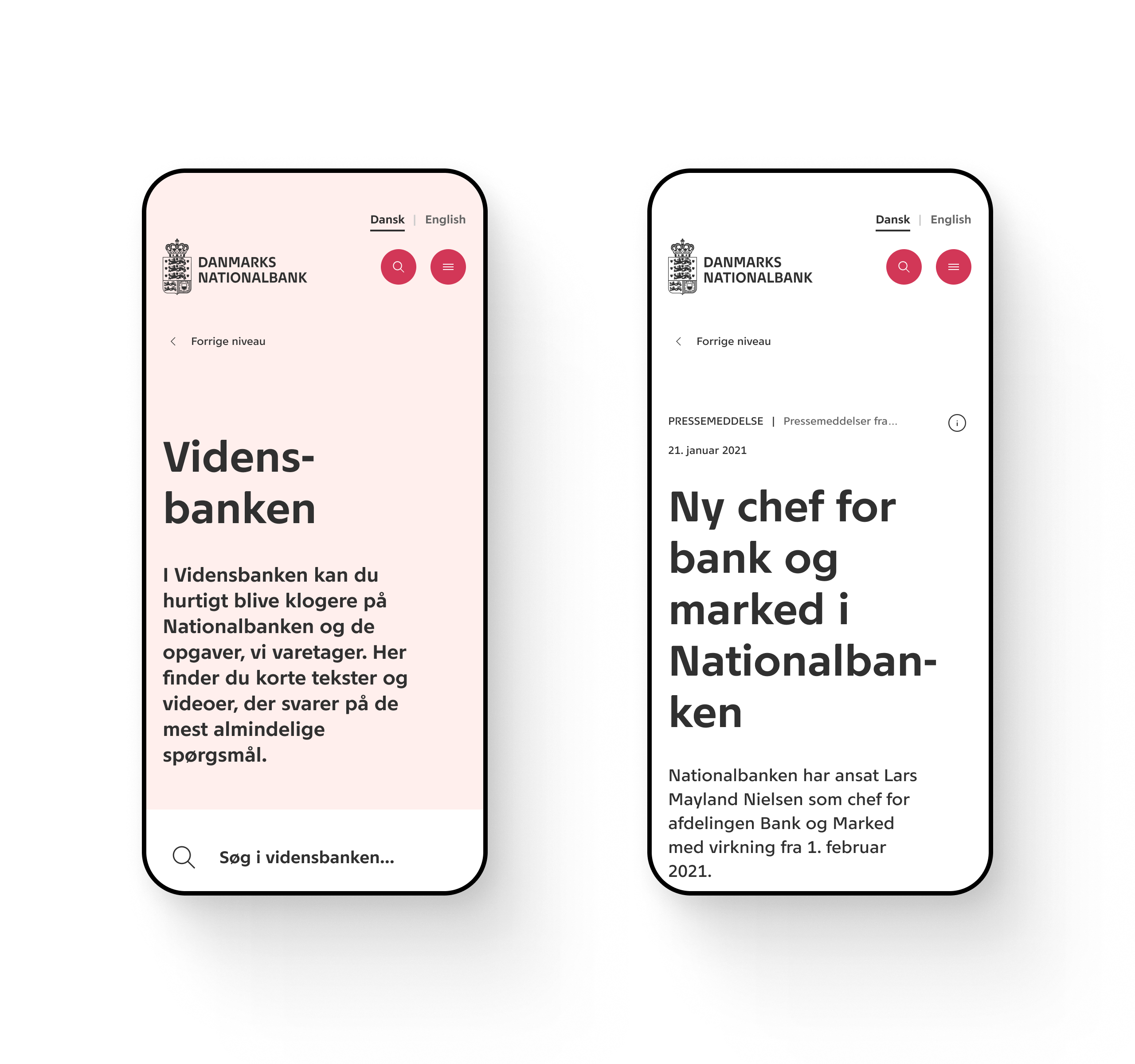
A key focus was rethinking long-form reports — some exceeding 40+ A4 pages — transforming dense, complex content into a clear and intuitive reading experience. Across the site, users can easily access the latest insights, news, publications, and events — on mobile and desktop alike.
One cohesive identity, bridging digital and print.

02 The design
I created a bold yet simple design, grounded in a newly defined digital identity — and made sure it was more than just a visual layer. It became a system. A foundation that could scale, evolve, and stay consistent over time.
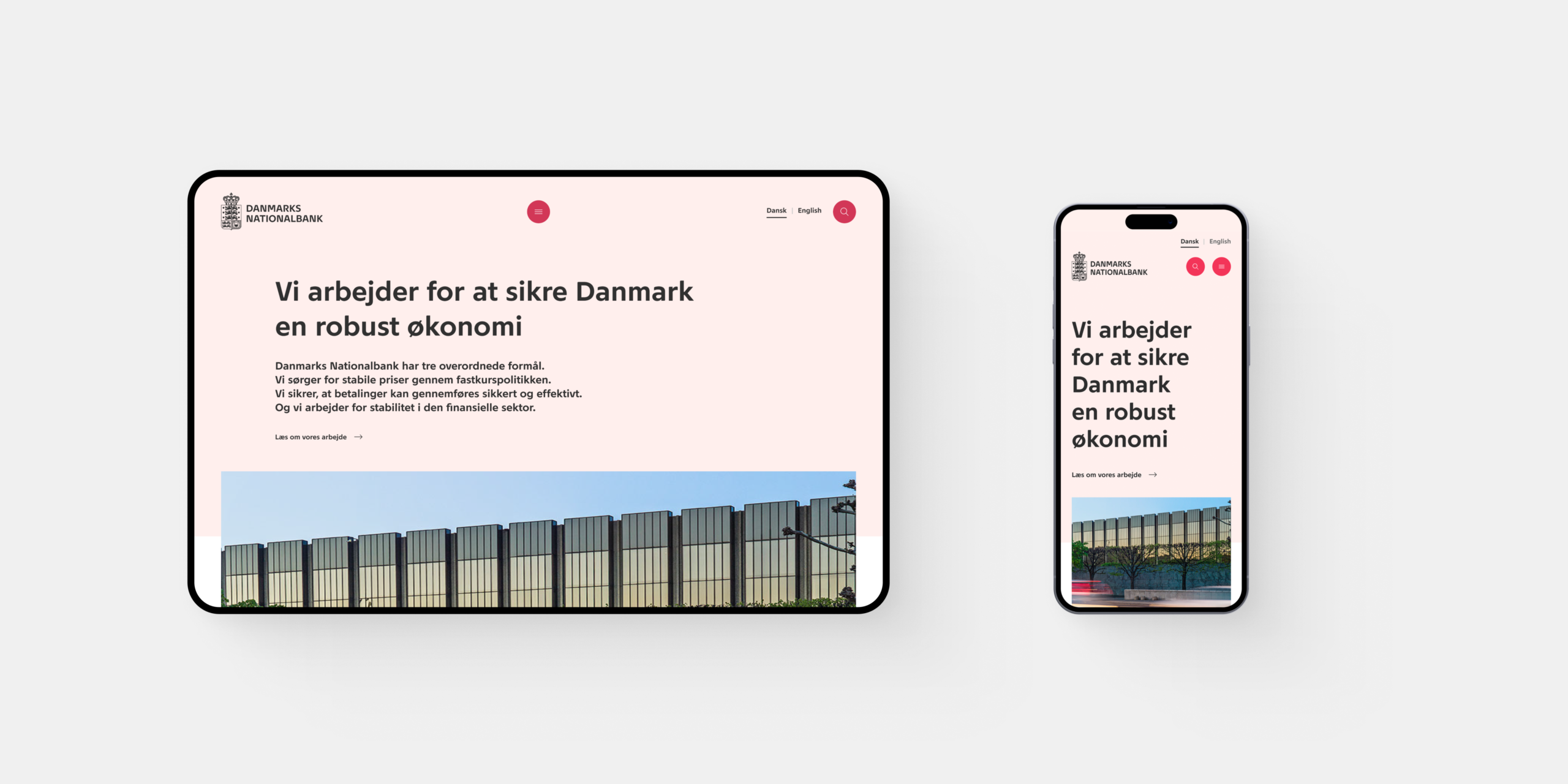
The approach was mobile-first, but never mobile-only.
While mobile usage continues to rise, the audience of Danmarks Nationalbank relies just as much on desktop — especially when diving into data-heavy content and in-depth reports. Designing for both contexts was essential.
The site should give a good experience for those who are in transport or doesn’t want to boot up their laptop. But the experience should also be good for those economist, journalists, etc. who’s primary workday is in front of a large screen.
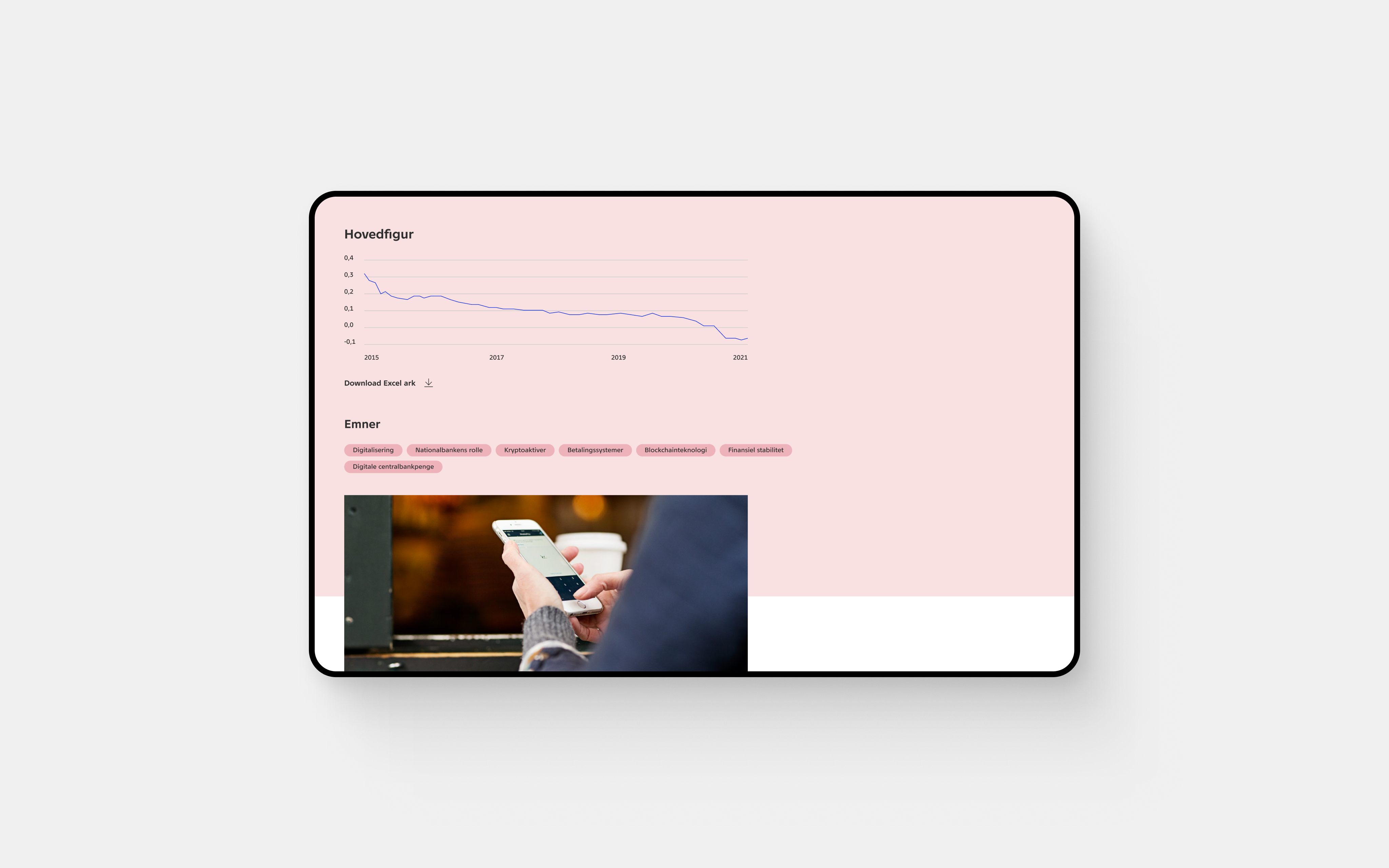
Through multiple iterations and careful refinement across breakpoints, the result is a fully responsive experience that feels intuitive and balanced on any device.
The design idea
I designed the digital experience for Danmarks Nationalbank with a deliberately institutional and disciplined expression that reflects the character of the organisation itself.
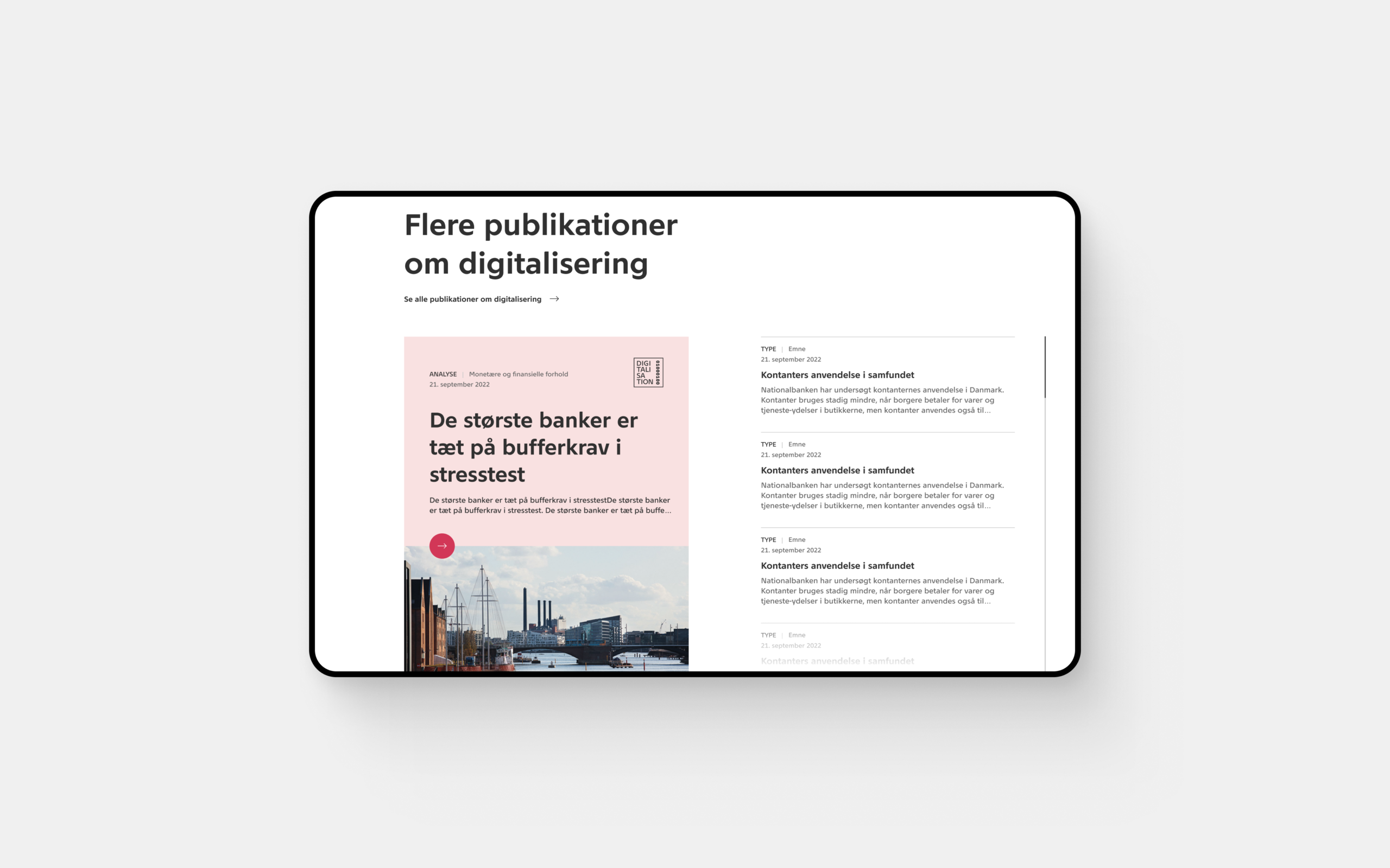
The navigation is intentionally predictable and structured, helping users find rates, analyses, statistics, and publications without unnecessary friction. Clear content blocks, concise introductions, and a restrained visual approach make pages easy to scan and navigate. As the content becomes more specialised, the experience naturally shifts toward expert users, which means entry points can feel less immediate for a broader audience.
The visual language is strict and modernist, built around generous white space, sharp grid structures, and an almost architectural rhythm inspired by the legacy of Arne Jacobsen. I kept the visual temperature low, using restrained colour, minimal decoration, and very little visual noise to emphasise authority, calm, and trustworthiness over personality. The focus was on information design before branding — creating a stable, legible framework where statistics, analysis, policy, and navigation feel clear and dependable.
I used the typography to reflect the institution’s identity through a neutral and understated expression. A clear hierarchy between headings, subheadings, and body copy creates structure, while generous spacing and line height make dense and complex content easier to read. Rather than adding personality, the typographic system is intended to communicate clarity, stability, and authority.
The result is intentionally understated, slightly cool, and highly controlled: a design that supports the institution’s role by putting credibility first.


Design system
The bank wanted more than a visual refresh — they needed a design system that could support a fast-paced editorial workflow while ensuring consistency across the entire site.
The system sets clear principles for hierarchy, typography, color usage, layout, and structure. Not to limit creativity, but to guide it. It gives editors a reliable framework that makes building pages intuitive, efficient, and cohesive — even when deadlines are tight.
The result is a robust, scalable design system. Designed to last, flexible enough to evolve, and strong enough to keep the experience consistent for years to come.
Navigation is clear. Layouts are structured but flexible. Typography and spacing support readability — whether you’re skimming a short news update or immersing yourself in a 40+ page report. The design reduces friction and lets the content lead.
The digital direction also influenced the bank’s printed materials. Principles, hierarchy, and visual language carried across formats, creating a cohesive experience between screen and paper. One identity. Multiple touchpoints. A unified expression.

03 The process
I worked on a year-long engagement with Danmarks Nationalbank, collaborating closely with UX, business stakeholders, frontend developers, and internal representatives.
The project ran in a hybrid setup across agency, remote work, and on-site collaboration. Being embedded in the client’s environment ensured continuous access to context and decision-makers, which strengthened alignment and improved decision speed throughout the project.

Driving design direction across stakeholders
A core part of my role was translating input from multiple stakeholders into a clear and actionable design direction.
This involved continuously aligning business priorities, user needs, and technical constraints, and making decisions in situations where requirements were evolving or incomplete. I often facilitated alignment between stakeholders to ensure decisions were grounded, coherent, and implementable.
My primary counterpart was the Head of Design at Danmarks Nationalbank, and over time we developed a strong working rhythm based on trust, fast feedback, and shared ownership of outcomes.
Designing in a high-context environment
Working closely with the client allowed me to operate with high context awareness and strong decision velocity.
Assumptions could be validated early, and design decisions were continuously anchored in real operational constraints. This was particularly important in a detail-driven, regulated environment where consistency, accessibility, and CVI compliance were critical.

Aligning design and development
I worked a few weeks ahead of development to ensure a continuous flow between design exploration and implementation.
A key part of my role was aligning early with frontend developers to evaluate feasibility, estimate effort, and surface trade-offs before presenting solutions. This allowed design to be communicated as structured options with clear implications rather than fixed deliverables.
Embedding feedback into the process
Instead of gated approvals, feedback was embedded continuously in the process.
Frequent reviews and ongoing alignment across stakeholders and development enabled iterative decision-making. This reduced late-stage rework and strengthened shared ownership across disciplines.
04 The conclusion
I designed Danmarks Nationalbank’s new digital home with a clear ambition: to create a contemporary and trustworthy experience built to last.
The challenge was not only to refresh the visual identity, but to create a scalable digital foundation that could support the bank’s growing editorial needs over time.
A central part of the work was transforming complex, content-heavy material — including long-form reports of more than 40 pages — into a clearer and more intuitive reading experience. I focused on creating structured yet flexible layouts, strong typographic hierarchy, and responsive behaviour that made the content feel accessible across both mobile and desktop.
Beyond the interface itself, I developed a robust design system that gave editors a reliable framework for building pages quickly and consistently. It established clear principles for hierarchy, typography, colour, layout, and component behaviour, making it easier to maintain cohesion across the entire site while leaving room for future evolution.
Over the course of a year-long collaboration, I worked closely with UX, business stakeholders, developers, and internal teams to translate evolving requirements into clear design direction. By aligning user needs, business priorities, and technical constraints early in the process, I helped shape a platform that feels cohesive, practical, and built to support both everyday editorial workflows and long-term strategic growth.
Lets connect
I am an experience designer with base in Copenhagen.
I work with digital concepts, and bring them to life with visual design, UX and prototyping. I believe in close collaboration with the clients, strategist and developers, to meet the wants and needs of the clients and the end users.
There are no trackers or cookies on this site.
Feels good, doesn't it? ❤️
