
A redesign of the
Payment Form
for netbank users
Client
In-House. Netcompany Banking Services
When
2025
Deliveriables
Concept Development, UX & UI Design, Design System
Summary
Table of Contents
01. From Challenge to Direction
02. Look & Feel
03. Design
04. Accessibility
05. Process
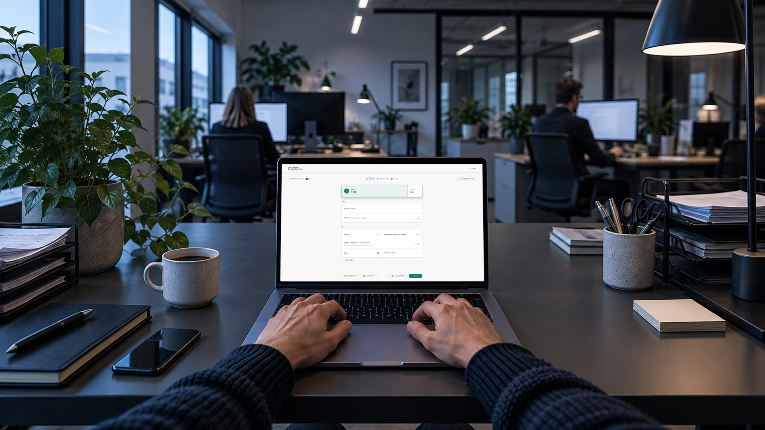
In 2025, I redesigned the Payment Form for the Netcompany Banking Services platform, focusing on usability, accessibility (EAA compliance), and a clear desktop experience.
The Payment Form was part of a large-scale initiative involving approximately ten banks, working together to shape the next generation of online banking for business users, with selected features later becoming relevant for private banking customers as well.
While the project was not initially design-driven, UX and UI became increasingly important as the work progressed. Because online banking is a tool people rely on every day, even small changes can have a significant impact on established habits and workflows. This required a careful balance between improving the experience and maintaining familiarity.
The project contributed to a refreshed look and feel that extended beyond the Payment Form itself. The design principles and visual direction established during the project influenced the broader online banking platform and became part of a wider modernization effort. It also gave me the opportunity to create web design system principles that mirrored the bank's mobile app experience, resulting in a more cohesive and consistent user experience across channels.
01.
From Challenge to Direction
The redesign began with a focused objective: reduce scrolling on desktop devices. Feedback from business banking customers showed that the existing payment form felt long and difficult to navigate, with information spread across numerous input fields that made it difficult to maintain an overview.
At the same time, I had already introduced smaller improvements to UI components across the business banking platform. These updates focused on accessibility, a more modern visual language and laying the foundation for a future design system. The payment form became a natural opportunity to bring these initiatives together within one of the platform's most important user flows.
As the project evolved, it became an opportunity to improve accessibility, establish common design principles and create a more coherent user experience across the platform. Introducing a new design direction for such a critical banking workflow required close collaboration with both the participating banks and the steering committee. By grounding decisions in user needs and accessibility principles, the redesign gradually gained support.
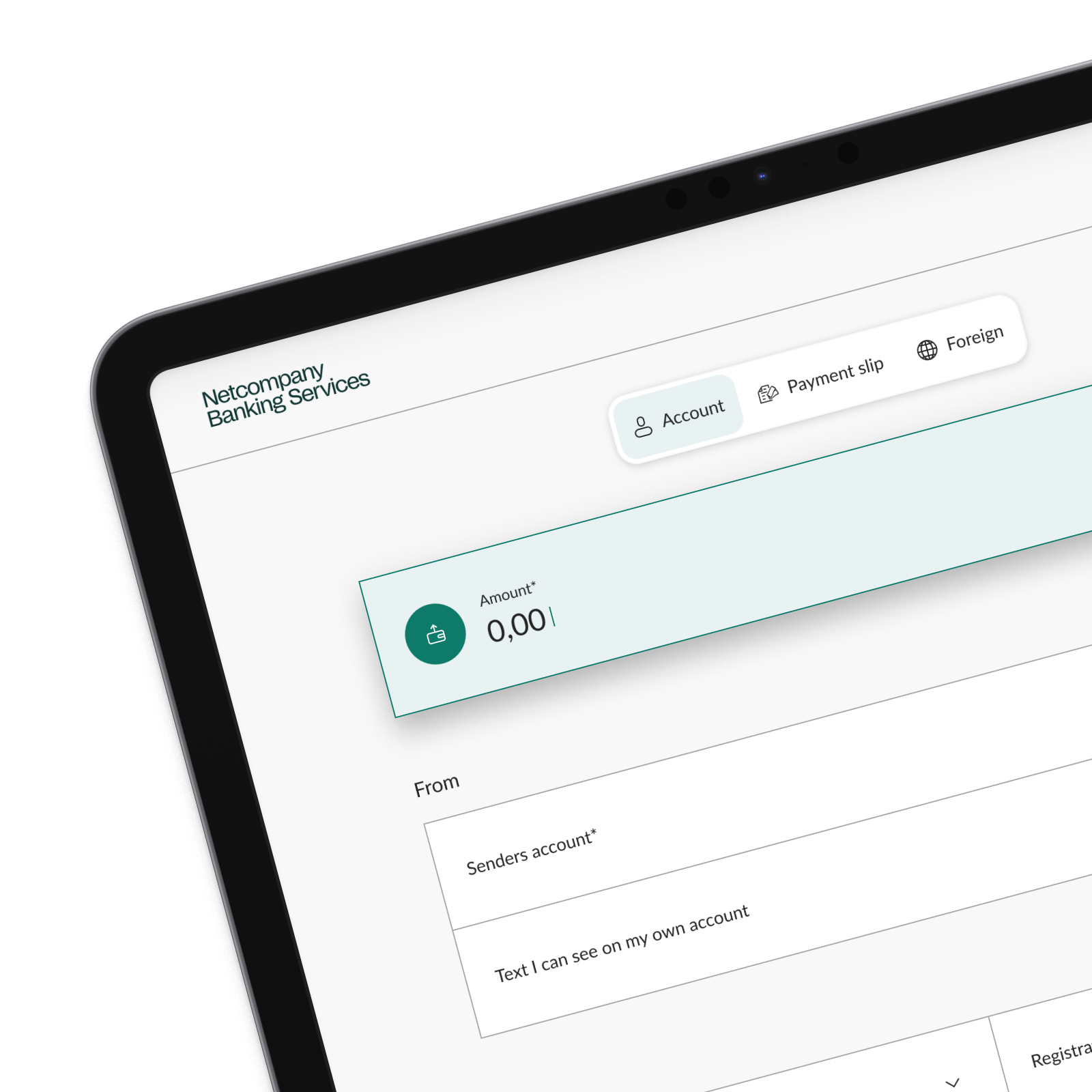
Reducing scrolling ultimately required more than simply rearranging the layout. The input components were redesigned to create a denser, more structured interface that presented more information within the same viewport while improving clarity and usability.
The result was a shared design direction that balanced business customer needs, stakeholder expectations and long-term product goals, while laying the foundation for a modern look and feel that can gradually be rolled out across the entire web banking platform.

02.
Look & Feel
The visual direction for the new payment form focused on creating a clearer and calmer experience. The goal was to strengthen the visual hierarchy, make it easier to understand where to start, improve readability and accessibility, and give the interface a more contemporary expression while preserving the familiarity users expect from a banking experience.
Typography, colour and elevation were used to guide attention towards the active elements, allowing users to scan the form more quickly and understand the structure at a glance. Rather than presenting every field with equal visual weight, the design establishes a clear hierarchy that supports the payment flow from top to bottom.
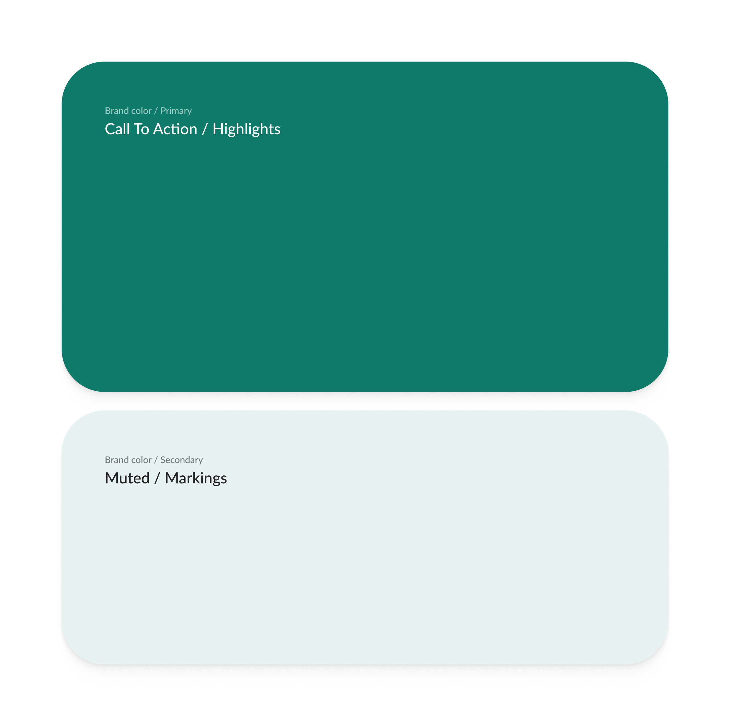
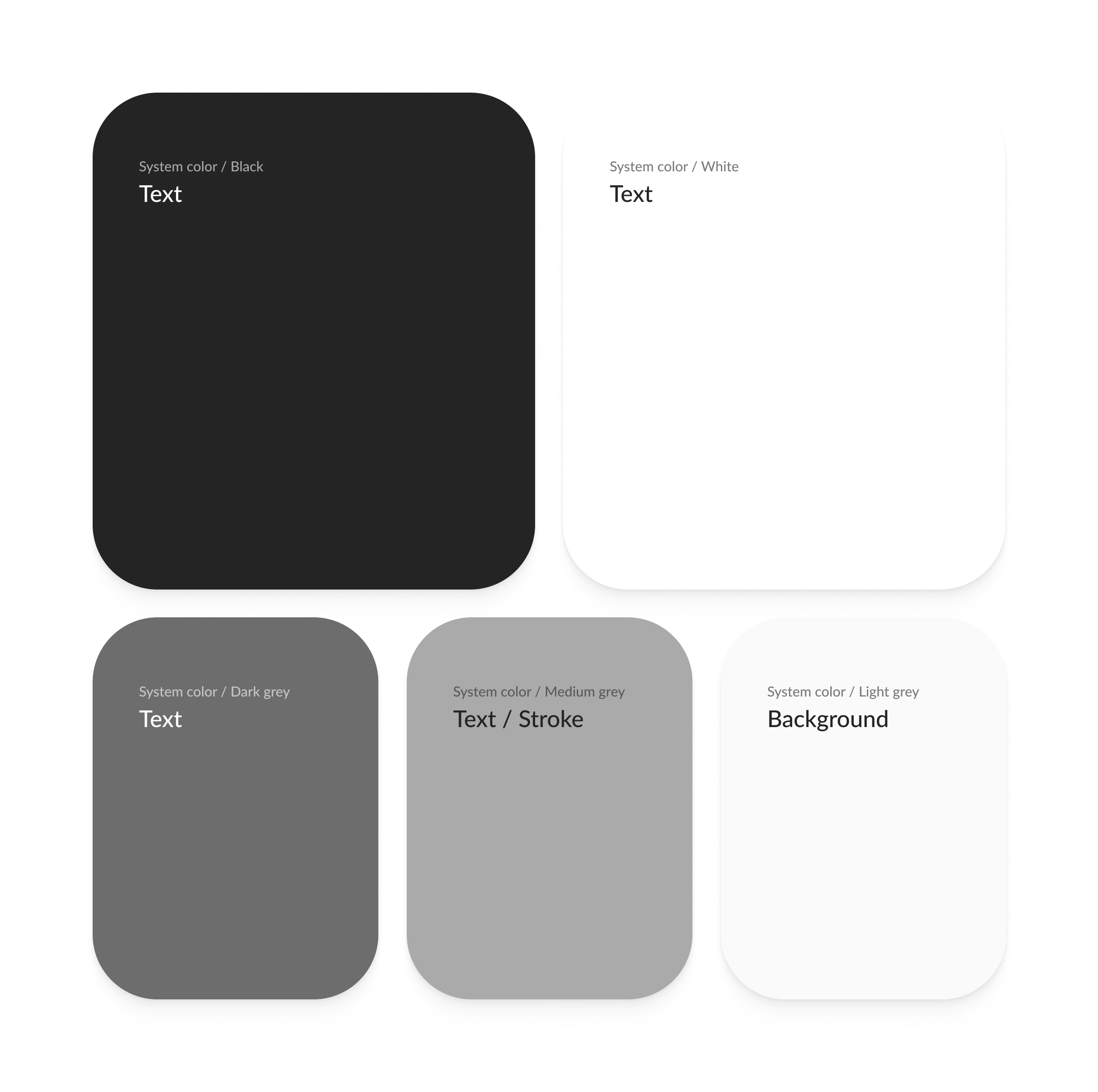
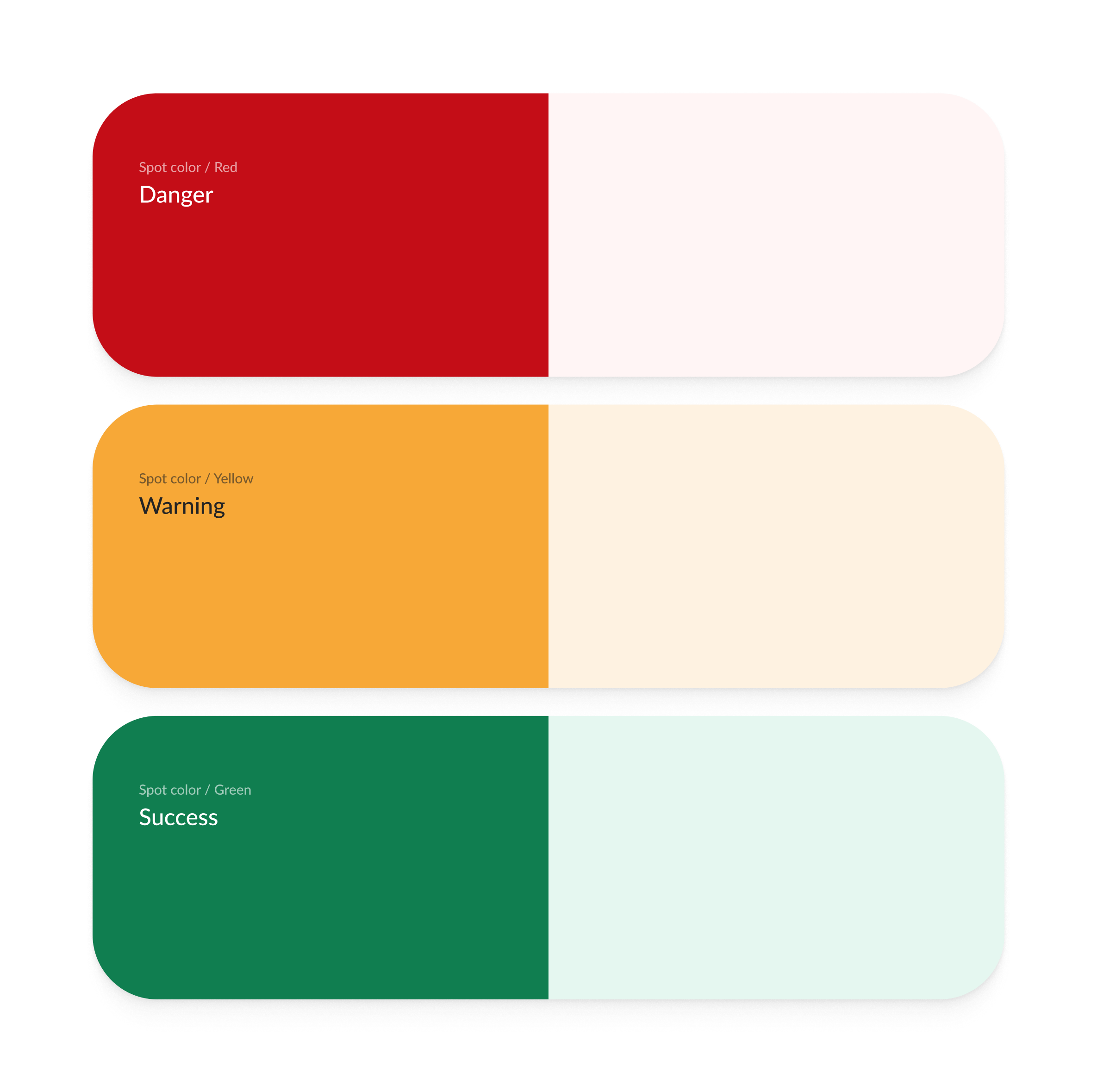
The colour system was designed to balance brand identity with accessibility. Each bank's primary brand and background colours were preserved to maintain a familiar visual identity, while the remaining UI colours—such as text, notifications and supporting interface colours—were standardised across the platform.
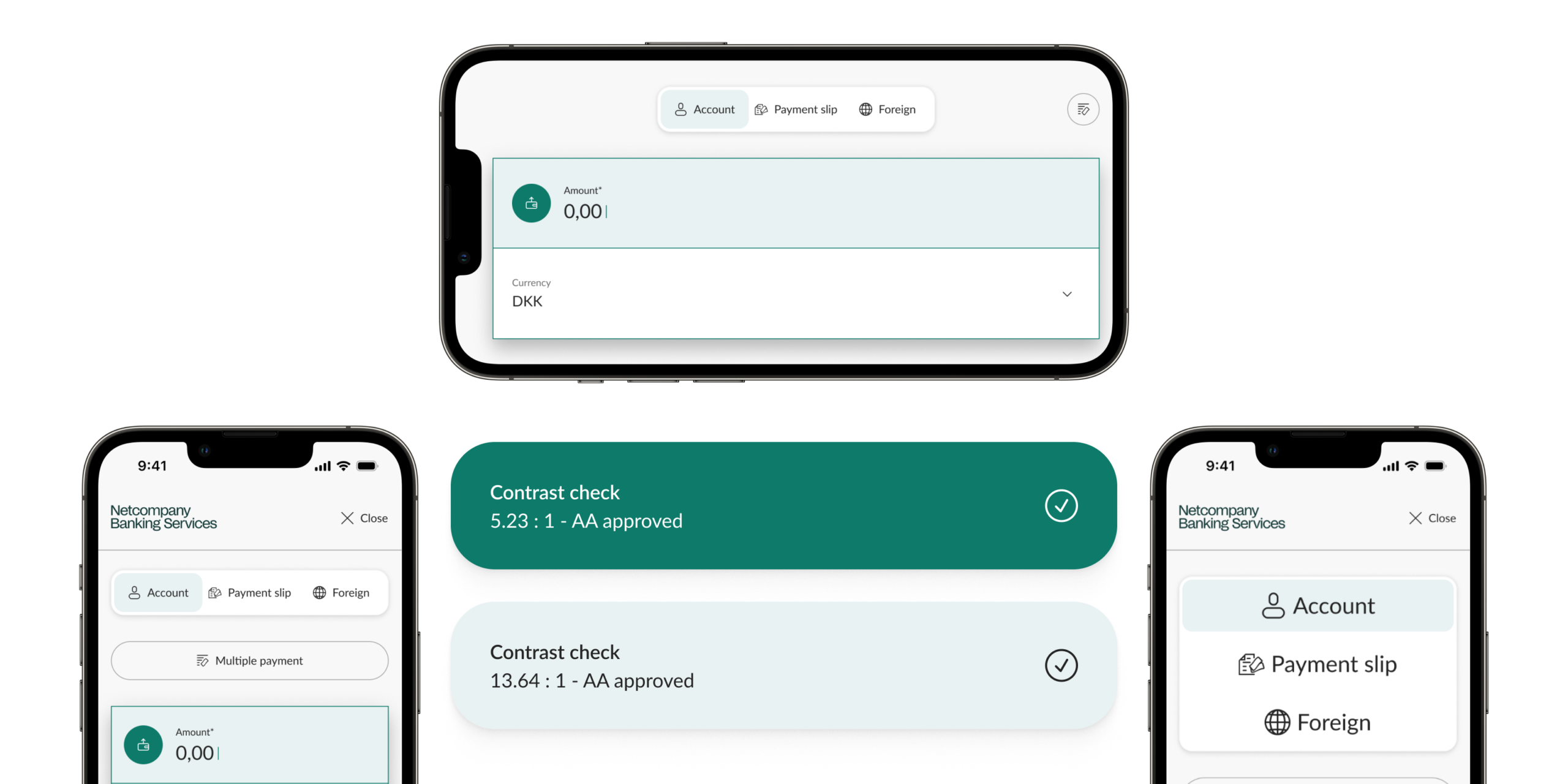
This approach made it easier to meet the colour contrast requirements introduced by the European Accessibility Act (EAA), reducing the risk of individual brand palettes creating non-compliant combinations. While it limits the ability for each bank to customise every interface colour, it establishes a consistent, accessible and scalable foundation across all banking experiences.
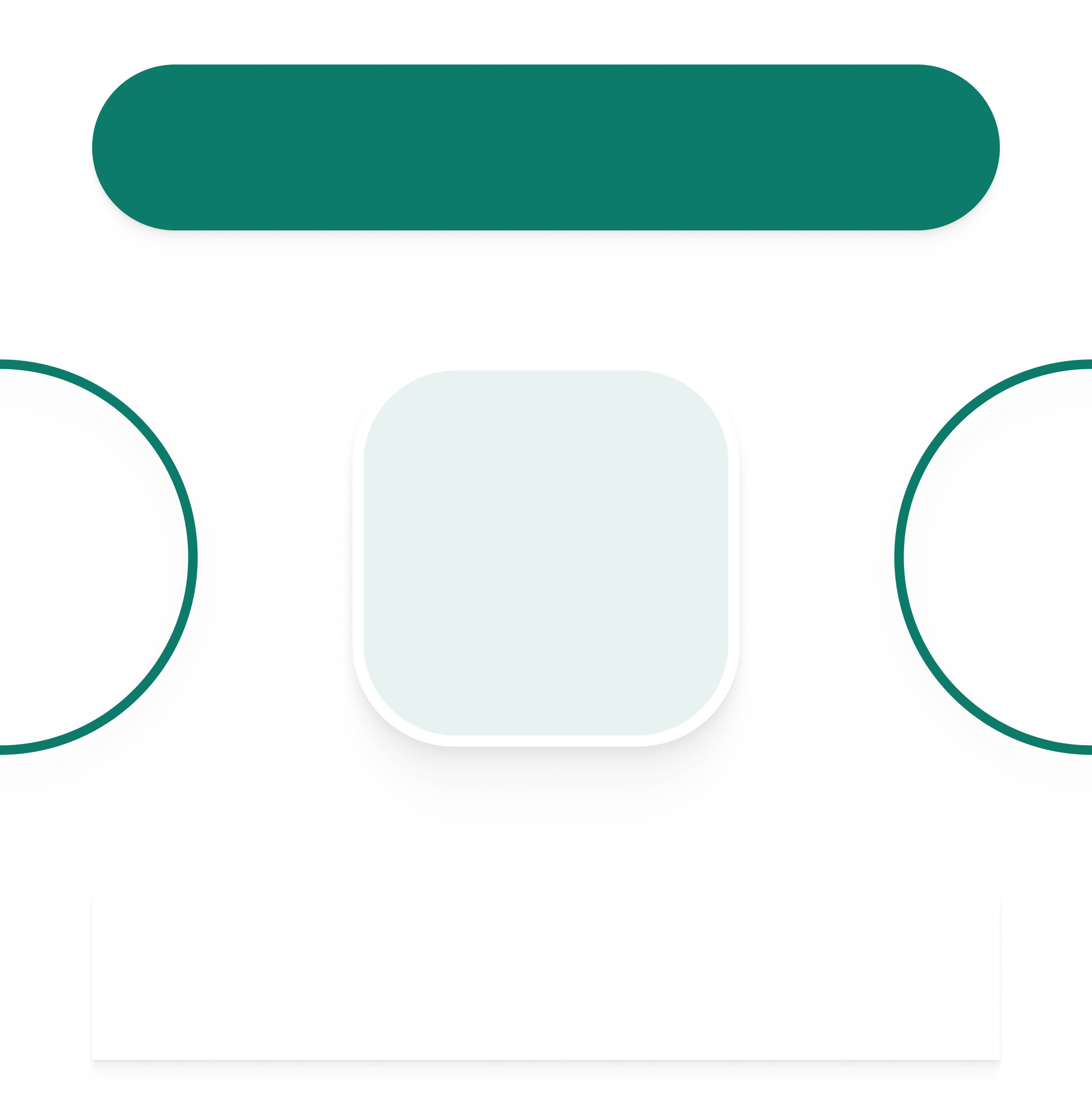
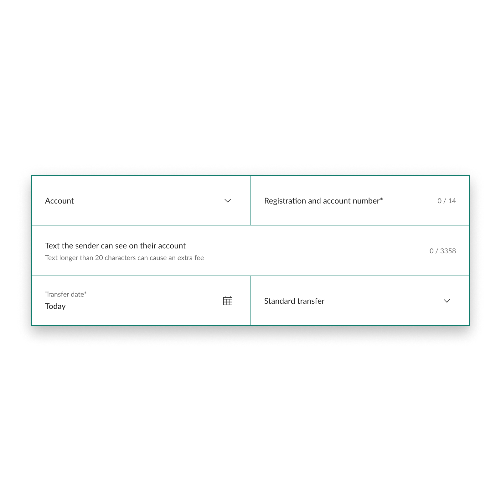
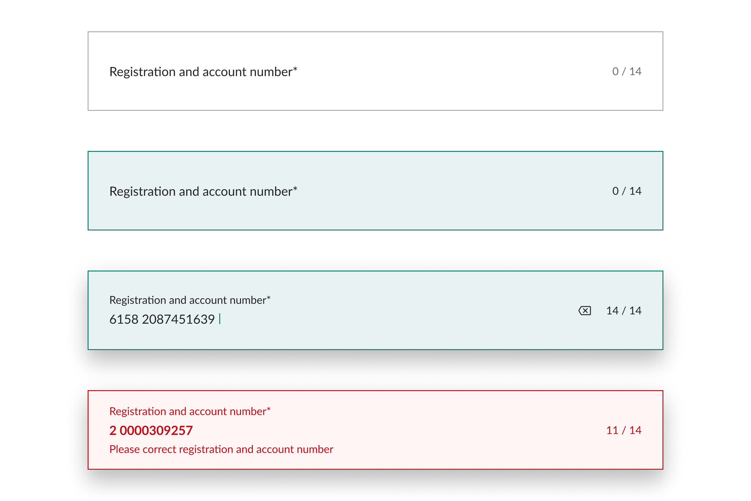
The input fields evolved from simple underlined inputs into clearly defined components that feel more tangible and invite interaction. Grouping related fields into shared containers created stronger visual sections, making the form feel more structured while reducing cognitive load.
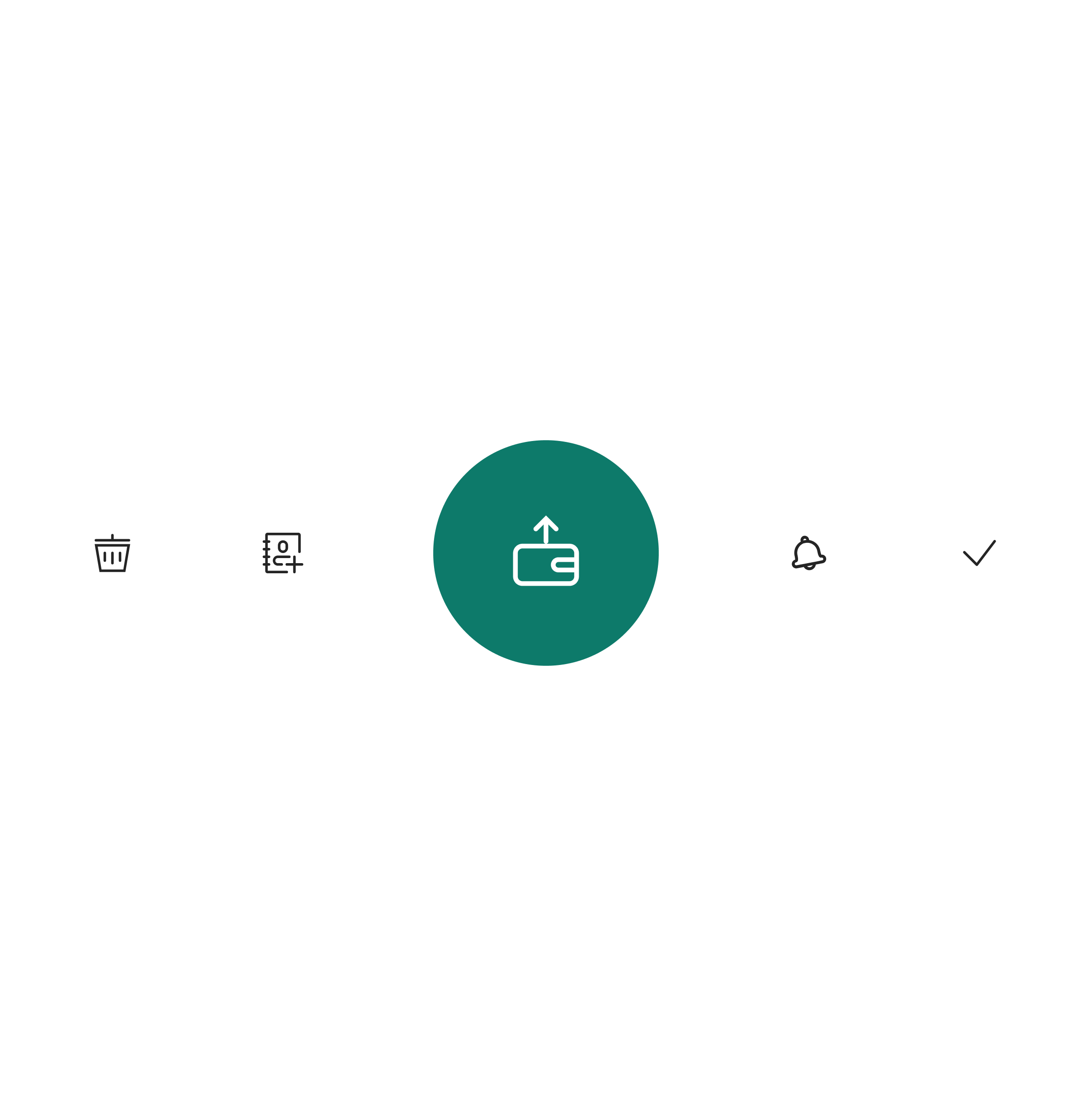
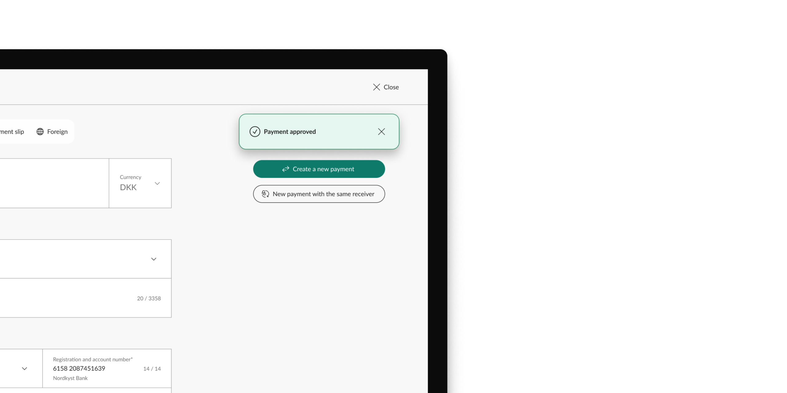
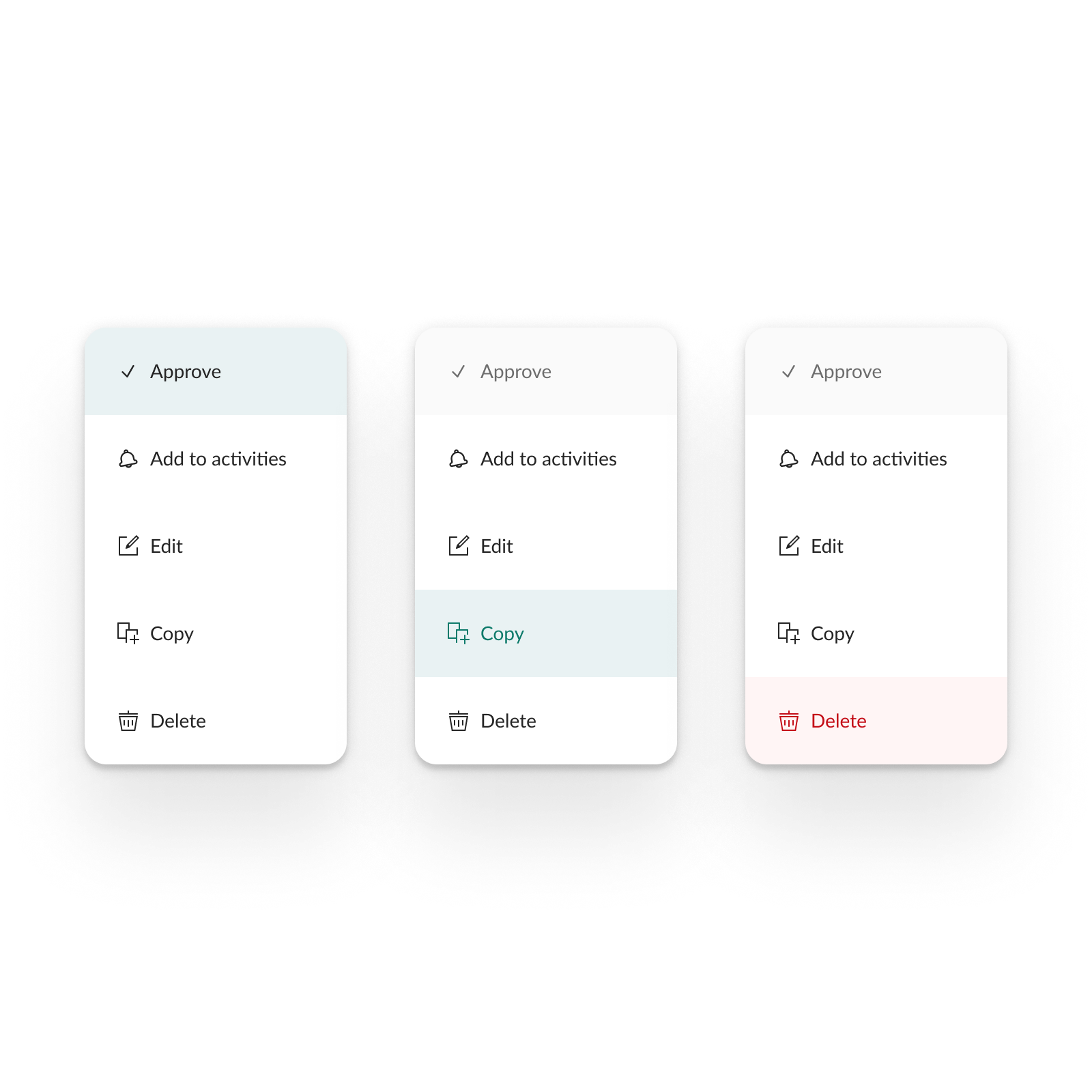
The actions were also redesigned to establish a clear visual hierarchy. Primary, secondary and tertiary button styles give each action an appropriate level of emphasis, helping users immediately recognise the next step while contributing to a calmer and more balanced visual composition.
Together, these changes establish a more cohesive visual language that feels modern without compromising familiarity. The refreshed look and feel improves clarity, supports accessibility and creates a scalable foundation that can evolve consistently across the wider banking platform.

03.
Design
Target audience
Business users
Device
Desktop first
Responsive
Yes
Goals
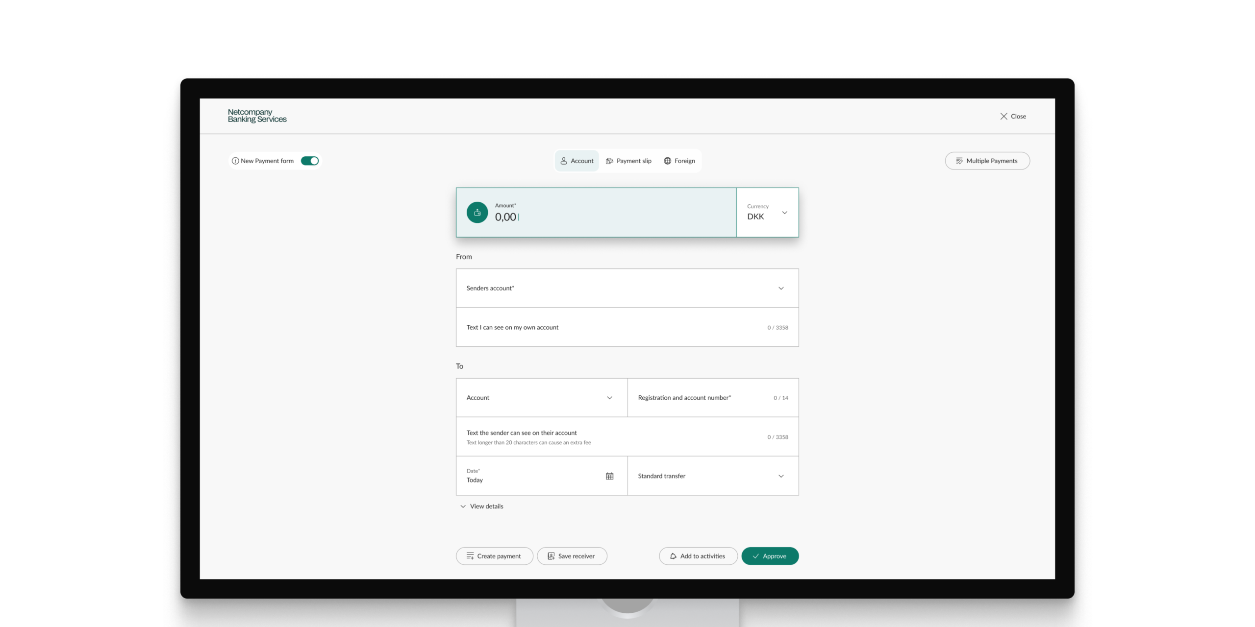
The redesign was initiated with a clear objective from the working group: reduce scrolling as much as possible. Feedback from participating banks showed that the existing payment form required users to navigate through a long sequence of input fields, making it difficult to maintain an overview while completing a payment.
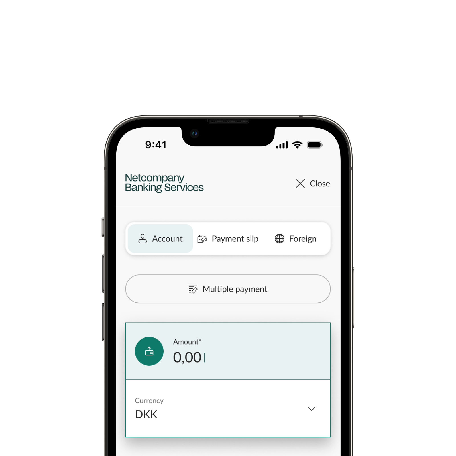
Since the primary users are business banking customers, the solution was designed first and foremost for a desktop resolution of 1920 × 1080, where most payments and transfers are carried out. At the same time, the design was developed with responsive behaviour in mind, and selected tablet and mobile examples are included in this case to demonstrate how the solution adapts across different devices.
Beyond reducing scroll, the redesign also aimed to improve accessibility, modernise the visual language and establish a flexible foundation that could support multiple Nordic banks while respecting each bank's existing workflows and visual identity. The ambition was not to reinvent the payment experience, but to create a solution that felt familiar to existing users while being easier to understand, navigate and extend in the future.
Solution
Every design decision was guided by a simple principle: improve the experience without forcing users to learn a new one. The payment form is one of the most frequently used and business-critical parts of the platform, making familiarity just as important as innovation.
Rather than redesigning the payment flow itself, the focus was on removing friction. Related information was grouped into meaningful sections, allowing users to process information in smaller, more manageable chunks. This created a clearer visual structure while significantly reducing the amount of scrolling required to complete a payment.
Accessibility became an integral part of the design rather than a final validation step. Input fields were redesigned to look and behave like interactive components, visual states became clearer, and typography, spacing and colour were used to strengthen hierarchy instead of adding visual complexity. Every element was designed to help users focus on the information they were actively entering.
Although the visual language became more contemporary, the underlying interaction patterns remained familiar. Existing users could rely on the same mental model while benefiting from a cleaner interface, clearer calls to action and improved feedback throughout the payment flow.
Finally, the solution was designed to extend beyond a single payment form. Reusable components, consistent interaction patterns and a flexible layout established a foundation that can support future payment scenarios across multiple Nordic banks while respecting each bank's visual identity.
04.
Accessibility
Accessibility was not treated as a separate requirement introduced at the end of the project. It became one of the core design principles that influenced the redesign from the very beginning. Alongside reducing scrolling and improving the overall user experience, the goal was to create a payment flow that was easier to perceive, understand and navigate for everyone, while preparing the platform for the requirements introduced by the European Accessibility Act (EAA).
Many of the design decisions were therefore driven by accessibility rather than aesthetics alone. A stronger typographic hierarchy, improved spacing and clearer grouping of related information made the interface easier to scan and understand. Interactive elements were redesigned to appear more tangible and recognisable, while colour, size and elevation were used consistently to guide attention and communicate hierarchy without relying solely on colour.
One of the more complex challenges was balancing accessibility with each bank's visual identity. Every bank has its own brand colours, but not all combinations met the contrast requirements defined by the EAA. To address this, I created a colour system that preserved each bank's primary brand colours for key interface elements such as primary actions and backgrounds, while introducing a shared set of accessible colours for typography, notifications and semantic states. This approach maintained each bank's visual identity while ensuring a consistent and compliant experience across the platform.
Accessibility also became an important consideration in the underlying design system. Rather than solving accessibility on individual screens, the components themselves were designed around shared principles for contrast, hierarchy, spacing and interaction. This established a more consistent foundation across products, simplified future implementation and helped ensure that accessibility could scale alongside the platform.
05.
Process
The redesign was led by me as the sole designer on the project, responsible for both the UX and UI throughout the entire design process. The work was developed in close collaboration with product owners, developers, accessibility specialists and representatives from approximately ten banks across the Nordic market.
During the early stages of the project, weekly check-in meetings were held with the participating banks. These sessions provided an opportunity to present progress, discuss design decisions and, equally importantly, establish strong working relationships across the group. As the project matured and a shared understanding had been established, the meetings naturally transitioned to a bi-weekly cadence while feedback continued to shape each iteration.
Alongside the stakeholder meetings, I held weekly sessions with the lead frontend developer to validate ideas, discuss technical considerations and refine the designs before presenting them to the banks. This close collaboration helped identify potential implementation challenges early and ensured that design decisions were both user-centred and technically feasible.
Because the payment form is one of the most business-critical parts of the platform, every design decision had to balance innovation with familiarity. New ideas were evaluated not only from a usability perspective, but also against existing user behaviour, technical constraints and the operational needs of the banks. This helped ensure that improvements strengthened the experience without disrupting established workflows.
The process also became an opportunity to establish shared design principles that extended beyond the payment form itself. Decisions around hierarchy, component behaviour, accessibility and interaction patterns were documented and refined throughout the project, creating a stronger foundation for future development across the wider business banking platform.
By involving stakeholders throughout the entire process, feedback became part of the design rather than a final approval step. This created shared ownership of the solution and allowed the project to move forward with a high degree of confidence as the redesign gradually evolved from improving a single form into defining principles for future product development.
Design is never done. It just gets better.
Let's build it together.
 Follow along on Instagram